Dunn-Edwards
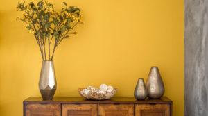
Honey Glow, golden yellow with orange undertones. According to Dunn-Edwards, it “evokes feelings of curiosity and a natural marveling at the world around us. It represents global and cultural trends toward warmth, the exploration of new territories and celebrating life filled with color.”
10% of the sales for this color are going to Honey Love, a non-profit that helps bees avoid extinction. That’s Cool.
Benjamin Moore
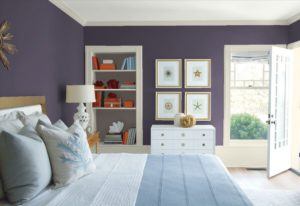
Always a class act, Benjamin Moore’s pick for 2017 is Shadow 2117-30.
This is a good example of a color selection that is so so on a paint sample but looks great when up on a wall. In my opinion this color looks best in rooms with a lot of natural light.
Sherwin Williams
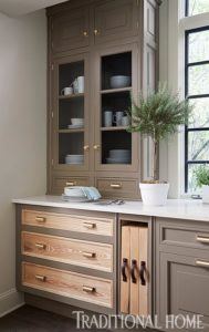
Poised Taupe. Sherwin Williams pick:
As they say, “not my cup of tea” Blah.
Glidden
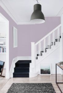
Byzantine Blue—”It stretches the boundaries of purple to borrow all of best qualities of blue and gray, making it an appealing color choice for nearly any room,” says Misty Yeomans, PPG color marketing manager.
Olympic
Cloudberry:
Dee Schlotter, marketing manager, Olympic Paints & Stains brand. “Cloudberry conveys retreat from the pressures of daily life, encouraging meditation and mindfulness, inspiring more focus and less stress.”
Well that’s a mouthful but I like it.
Diamond Vogel
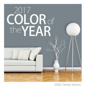
Ocean Storms. It’s a muted gray/blue. I like this pick by Diamond Vogel. It goes equally well inside as well as outside.
On exteriors it looks good next to white trim.
AkzoNobel
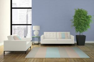
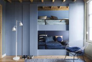
Denim Drift. According to Helen van Gant, Head of AkzoNobel’s Global Aesthetics Center. “It’s a beautiful, timeless and versatile grey-blue that takes on a different characteristic depending on how it’s used, perfectly capturing the mood of the moment and embodying our lives for 2017”
Blue’s and gray’s are the trend for this coming year and this color is a good addition to the mix.

